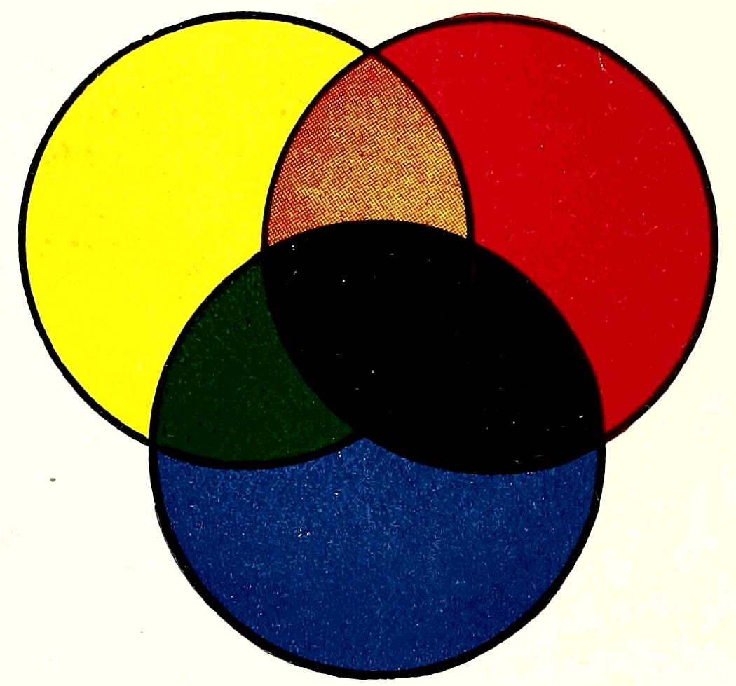
PRIMARY AND SECONDARY COLORS
The Project Gutenberg eBook of Color mixing guide, by John L. King
Title: Color mixing guide
for artists, painters, decorators, printing pressmen, show card writers, sign painters, color mixers gives color mixtures by parts
Author: John L. King
Release Date: December 9, 2022 [eBook #69507]
Language: English
Produced by: Richard Tonsing and the Online Distributed Proofreading Team at https://www.pgdp.net (This file was produced from images generously made available by The Internet Archive)
Transcriber’s Note:
The cover image was created by the transcriber and is placed in the public domain.

PRIMARY AND SECONDARY COLORS
All colors in this “color chart” are made from the primary colors, yellow, red and blue.
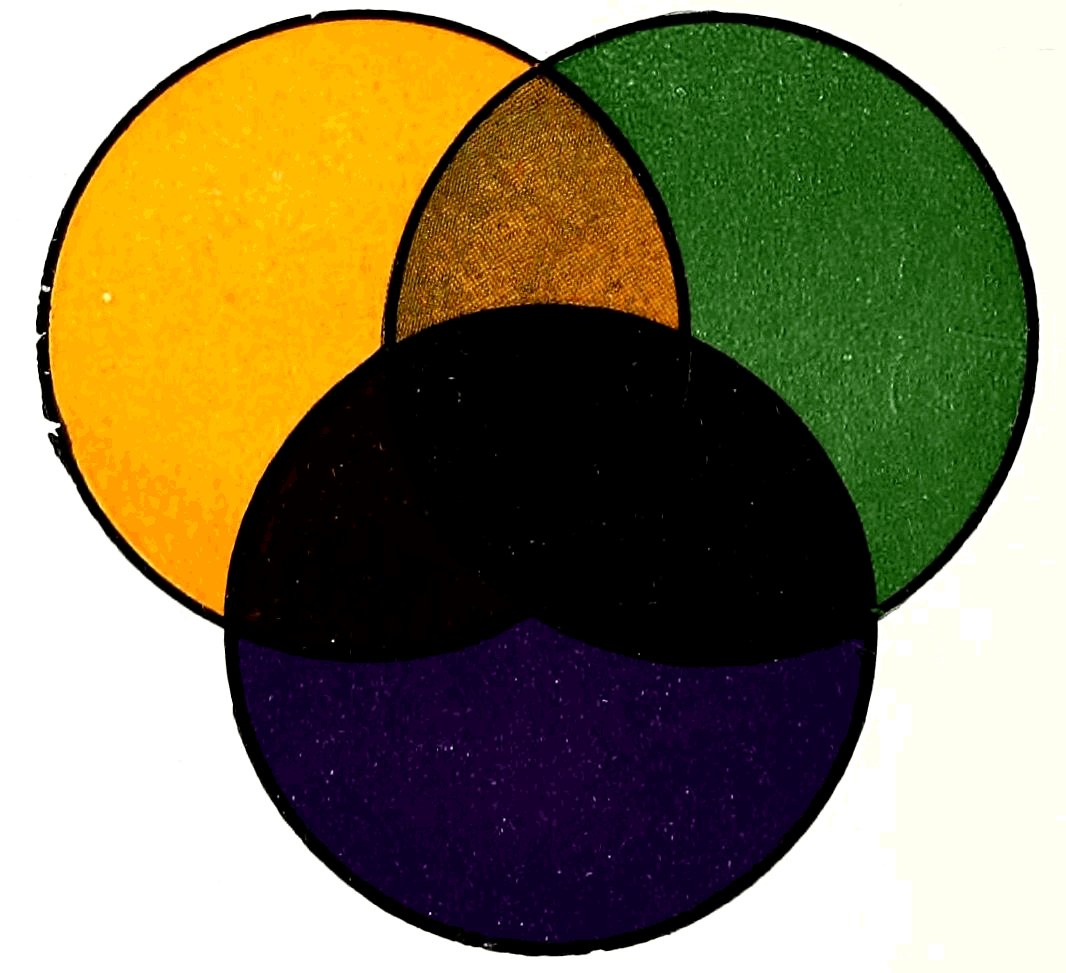
SECONDARY AND TERTIARY COLORS
Overlapping plates on this sheet are printed in full color. Tints are avoided in order to show secondary and tertiary colors in full strength.
To lighten secondary or tertiary colors add more of the lightest color of the combination. For example, if a lighter shade of primary green is more desirable, use more yellow; to deepen, add blue; to use as a tint, add white.
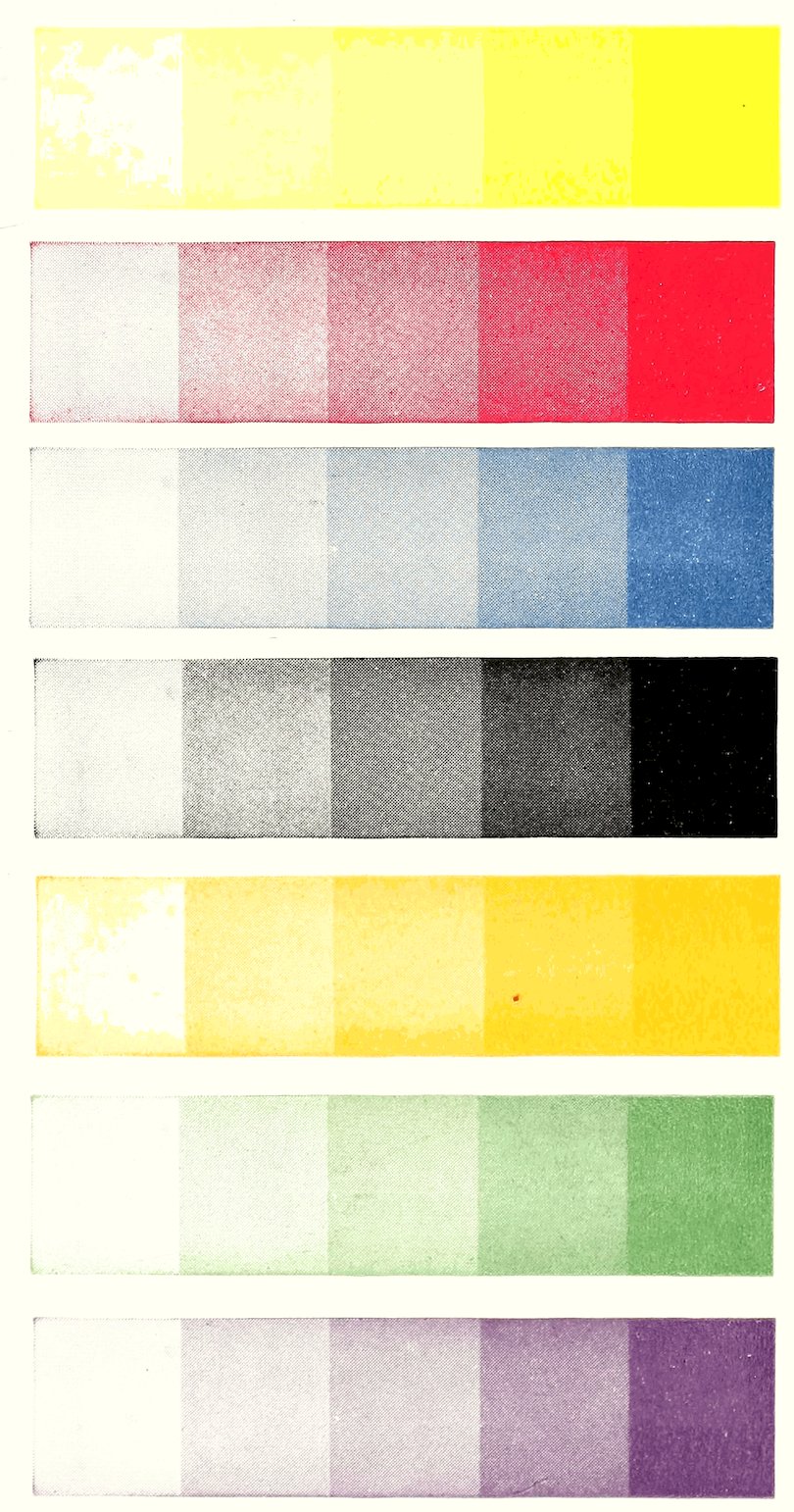
The above plates illustrate the primary and secondary colors broken up with light.
About three thousand colors and shades can be made from yellow, red, blue, black and white. This little Color Mixing Guide is worth many dollars, as it shows you exactly how, without waste of time and material.
No possession can surpass or even equal a good library to the lover of books. Here are treasured up for his daily use and delectation riches which increase by being consumed, and pleasures which never cloy.
Color is an effect caused by the reflection of certain rays of light. In order to understand this statement, it is necessary that we know what light is. Science teaches us that light is a form of intense vibration which reaches the earth direct from the sun. These vibrations affect certain nerves of the retina of the eye, causing the sensation known as color.
In the study of color, or in practice, it is necessary that we have a standard. The standard colors are those seen in the spectrum or in the rainbow. These colors are selected as standard colors because they are the true colors as reflected by pure light and they never change.
In dealing with pigments the primary colors are yellow, red and blue. They are called primary colors because all other colors are produced from them, and because they can not be produced by mixing other colors. In other words, they are the original colors from which all other colors are produced.
Cold and warm colors: Red warm, blue cold, yellow bright. White, which is also a cold color when added to black makes a cold gray. Yellow added to red forms a warm orange.
White is said to mean purity; blue, fidelity or truth; red, love or sacrifice; green, envy; pink, modesty; violet, innocence; yellow, jealousy; black, sorrow or distress, and lavender, passion.
Mixing colors is an art in itself. With a combination of the chief colors—red, yellow, blue (and black and white), thousands of shades and hues may be produced.
Mixed in various proportions, either in twos, or all three together, these three colors produce every hue in nature or in art, every tint that is physically possible.
The primary colors are yellow, red and blue.
The secondary colors are orange, violet and green.
The tertiary colors are citron, russet and olive.
The secondary colors are made as follows: Yellow and red make orange, red and blue make violet, yellow and blue make green.
The tertiary colors are mixed from the secondary colors as follows: Orange and violet make russet, violet and green make olive, orange and green make citron.
Black, white and gray are natural tones in which no color is apparent: White pales but does not brighten any color. Yellow is the brightening color and always stands out strong and advancing; to deepen a color, use its complementary color; to deepen yellow add purple; to deepen red add blue; to deepen blue add burnt sienna, then you will have purity of color.
Vermilion or any other red of orange hue (warm). Bluish blue (cold). These two colors mixed together in certain proportions form light brown, dark brown, red-brown, neutral brown and scarlet red. Purple made from this combination is inferior.
Today, color-blindness is a serious difficulty in the way of a person earning a living. A generation or so ago, it was considered a matter of small importance. Many persons, suffering from the disease, went through life without knowing they were afflicted. The only persons, as a class, who were greatly affected by the problem were railroad men, who had to take tests for the distinction of colors.
Today, with the common use of automobiles and the rapidly growing use of colored lights for signs and signals, color-blindness becomes an important matter.
The defect is hereditary and much more common in men than in women. A woman may have normal eyesight herself and yet transmit the color-blindness to her children. This is because it is what the geneticist calls a recessive character. A man may have a color-blind father and still not transmit the defect. But a color-blind woman, married to a color-blinded man, transmits the defect to all off-springs, both sons and daughters.
To brighten color, add yellow; to give it warmth, add red. To brighten and warm, add orange. To deepen and cool, add blue. To cool and lighten, add green; to deepen and warm, add purple.
Ultramarine blue contains sulphur and will tarnish with admixtures of pigment containing lead. Substitute zinc white.
Pigment is any color preparation used by painters, printing pressmen, etc. Coloring matter is found in pigment cells of plants, tissues of animals and fish; in mineral form found in the earth, from coal, vegetables, etc.
Pigments may be divided into two classes, the organic and the inorganic. Organic pigments are compounds of carbon and the inorganic all other pigments.
Paints and printers’ inks are made from the same pigments; the difference is in the mordant. It all depends on the nature of the object to be colored. The mordant is the fixer which holds the pigment.
The selection of color material should be carefully made. Purchase from reliable dealers an assortment of reds, blues and yellows, some black and white.
Nature has given us a wonderful color chart, of harmonious colors mingled together.
Flowers furnish countless color combinations which are perfect in every detail. Colors ranging from soft, delicate tints to deep, rich solids, are found in great variety.
Observe also the birds, whose plumage range from the most gorgeous to the so-called jet black raven or black birds; even they when viewed in sun or strong light reveal a picture of dazzling beauty. Beautiful tones and semi-tones of purple, green and blue blending perfectly with the black.
It is unnecessary to mention in detail, the fields, woods and forest, the seas, the lofty, stately mountain peaks of somber hues silhouetted against an azure sky or viewed in the setting sun.
The secret of harmony is equal value, complementary colors are the color or colors which, with any color or colors mentioned, make the three primary colors, which constitute white light. For example if given color is a primary, its complementary color is composed of the other two primary colors; the complementary color of blue is orange, red and yellow. And if given color be a secondary, its complementary color is the remaining color. Thus the complementary color of green, blue and yellow is red.
It is well to bear in mind whether the subject to be treated is a landscape scene, color design, form to be printed in colors, sign or house painting that equal value of colors is the correct way.
Any subject that has been ill-treated with too much red, or colors which do not harmonize, form a combination that irritates.
When colors are correctly used the effect is soothing. Remember that red is the most irritating color and a little will balance well with a large amount of other colors.
The object to be painted or printed has a lot to do with the selection of colors. It is well to study the subject carefully.
Printing pressmen have their problems. When printing on white material which is a neutral color he does not encounter the obstacles as when printing colored inks on colored material.
All fine pictorial color printing is executed on white material, this being the only way to get pure coloring, as it is generally printed with transparent ink.
Tint mixing is both interesting and profitable, but in order to obtain the best results, first-class materials are very essential. Great care should be exercised in the selection of this material, as the product of one manufacturer often varies, as to shade with that of another manufacture, therefore it is well for the color mixer to make it a rule, never to select colors promiscuously.
With the following colors at hand all known colors may be obtained. Lemon yellow, which is of greenish hue; yellow of orange hue; red with orange hue; red which has a bluish cast. Blue with a reddish tone, also blue with a leaning toward green. A liberal supply of white and some black which does not contain blue.
To produce a pure tint you must first produce a pure base of the primary colors. White, which is a neutral color, does not alter the original hue, it merely pales. In making pure greens from yellow and blue, the yellow and blue should contain none of the primary color red; use a greenish yellow and greenish blue. For pure orange use a yellow and red which contain none of the primary blue; the yellow must be of reddish hue, the red of yellowish cast. Pure violets are made with bluish reds and reddish blues. The red and blue should not contain any of the primary color yellow.
Gray tint is white with black in various proportions. Neutral gray must be mixed from a black which is unadulterated with a mixture of blue. To warm, add a touch of red; to cool, add a small amount of blue. The object in making neutral gray as above mentioned is to make possible 9a true blending with other colors. For example, a bluish gray is desired, add blue to neutral gray until the exact shade is acquired; for orange gray add a touch of orange, etc., etc.
Primary colors are made neutral by admixture, a medium or neutral yellow is obtained by mixing lemon yellow with orange yellow. The greenish tinge of lemon yellow is absorbed by the reddish tinge of orange yellow. Neutral red and blue is made in the same manner; likewise the blues.
As has been previously mentioned, white when added for tinting purposes does not alter the hues. For example, the result of adding white in any quantity to purplish red is a purplish pink tint, the purple hue will remain.
When warm tints are desired use a warm base. For warm pink select a red of orange hue, a cool pink from bluish red, a neutral pink must be made from a neutral base which is the result of adding primary bluish red and primary yellowish red.
In mixing special colors or shades for large jobs, first mix a small quantity, write down exact proportions either by weight or volume, keep a record for future reference.
If you have failed to keep a record and have a small quantity on hand and wish to duplicate it exactly, put a small amount on a piece of white paper and after mixing a little dribble or let it string across the original sample you can get a perfect match. Still another way; brush a small quantity on a piece of transparent glass, add a like amount of the paint you mix beside it and hold to the light.
To match a specimen in printing ink; mix the color (small quantity), ink up press, pull an impression then with your make ready knife cut a small hole (any shape) in the most solid part of print, lay this over a solid part of sample.
Alumina—One of the earths containing aluminum.
Aureolin Yellow—A transparent, delicate medium yellow. Is a nitrate of cobalt.
Amber—A mineralized pale yellow, and sometimes reddish or brownish resin of extinct pine trees.
Ambergris—A morbid secretion of the spermaceti whale of solid opaque ash color.
Aniline—A substance obtained from indigo and benzol, a product of coal tar.
Amaranth—The unfading flower; a color inclined to purple.
Antwerp Blue—A transparent color lighter than prussian blue; splendid to mix with yellow for greens and tints.
Bronze Blues—Made by mixtures of ferro and ferricyanides of iron and potassium or sodium. Bronze blue, so called for its bronzy effect. It is an opaque, deep blue, used almost exclusively by printers.
Bronzes—Are pulverized gold, brass, copper and aluminum. Can be dyed with aniline colors such as violet, green, etc.
Bone Black—Made by charring bones which are then finely ground. Semi-transparent.
Burnt Sienna—Raw sienna when burnt yields a brownish orange, quite transparent.
Buttercup—Common species of ranunculus, having bright yellow cup-shaped flowers.
11Bistre Brown—Obtained from soot of wood fires. A deep citron brown.
Cerulean Blue—A compound of oxides of tin and cobalt. Opaque, azure blue.
Claret—A red wine color.
Carmine—A very deep toned crimson red, of the lake family.
Cobalt—A mineral of grayish color, and a metal obtained from it, which in the state of oxide yields a permanent blue pigment.
When cobalt blue is unobtainable substitute ultramarine blue.
Cobalt Blue—A deep, rich, transparent blue of violet hue. Is often substituted for ultramarine.
Cobalt Green—Semi-transparent bluish green. This color and cobalt blue are of French origin, and the process of manufacture is practically the same.
Cadmium—A metal related to zinc; produces a bright semi-transparent yellow or orange hue.
Chrome Yellows—Made by precipitation of potassium bichromate, with lead acetate, varying in shade from pale yellow to deep orange. They are opaque, and of good covering strength.
Chinese White—A semi-transparent white of zinc oxides, equally as white as flake white.
Chrome—(Chromium). A metal which produces many colors and semi-colors. Chrome green now takes the place of the dangerous arsenical green pigment that was formerly used in printers’ ink, enamel and wall paper.
12Chrome Greens—Are a mixture of chrome yellow with blue.
Carbon Black—Soot formed with natural gas and forced through finely woven silk. One thousand cubic feet of gas being required to obtain one pound of black. Opaque.
Crimson Lake—Transparent red, similar to carmine, but less scarlet.
Cremnitz White Lead—An opaque white. Made permanent by coating with varnish.
Coal Tar Dyes—Are derived from coal tar by distillation and other chemical processes.
Much credit is due the cochineal as most all of our brightest reds can be attributed to them.
Scarlet and crimson furnish the base for carmine and lake. It requires seventy thousand dried bodies of this small insect to equal one pound of color.
The task of gathering cochineal is a tedious one. They are gathered by gently brushing them into cloth sacks with brushes made of fur just before egg laying time, as only the bodies of the female can be used. At this period they are scarlet, the brightest of all reds. Later they assume a deeper cast called crimson.
Dye is a colored substance which can be made soluble in either water or oil.
Dragon’s Blood—A resinous substance from the East Indies. A dull semi-transparent red.
Emerald—A stone or gem of bright green.
Fawn—Light brown.
13Flake White—A carbonate of lead. An opaque fine white.
French Blue—An artificial imitation of ultramarine, discovered by French chemists early in the nineteenth century. It is more transparent than the original, and an excellent imitation.
Gypsum—A mineral found in a compact state and crystallized state, as alabaster, or in the form of soft, chalky stone which by heat becomes the fine white powder known as plaster of paris.
Geranium Lake—A bright transparent red of bluish hue, also of yellowish hue. Should not be mixed with earth pigments such as raw sienna, ochers, umbers, etc. Geranium lake if a coal tar product is more permanent than if obtained from other sources.
Gamboge—A gum resin from trees, native of Ceylon. Is a bright transparent yellow of little depth.
Gallstone—Rich deep toned fugitive yellow from the gall bladder of oxen. Yellow carmine can be substituted.
Heliotrope—Flower of a grayish purple color.
Ivory Black—A rich transparent black, from charred ivory.
Indigo Blue—Deep blue from the leaves of the Indigofera plant of India.
Intense Blue—Purified Indigo blue.
Indian Yellow—Deposit obtained from the urine of the camel. A beautiful yellow.
14Indian Red—An earth pigment of Bengal. Ranges in color from a light, bright red to a dark red of purplish hue; nearly opaque; mixes well with all other colors except indigo. When genuine Indian red and indigo come into contact with one another, they soon assume a faded shade resembling rust.
Indian red substitute may be mixed with indigo substitute in safety; tints made are more permanent than obtained from the originals.
Lake Colors—The term “lake” as applied to color pigments, has reference to the method of manufacture. The pigment is produced by the saturation of a base with a dye in it, which is then ground in varnish.
Avoid mixing lake colors with raw earthen pigments if permanency is desired.
Lamp Black—Is made by burning creosote or tar oil. Opaque.
Lacquer—A varnish which has the appearance of enamel.
Maroon—A brownish crimson or claret color.
Mauve—A brilliant red violet, of the lake group. Also of a bluish violet hue. The most fugitive of all colors.
Marigold—Several composite plants bearing golden-yellow flowers.
Magenta is a brilliant blue-red color derived from coal tar.
Madder red is obtained from the madder plant roots, a climbing perennial.
15Mastic—Resin from a tree of southern Europe, yielding a varnish.
Mummy Yellow—The ancients obtained a dark yellow pigment by grinding mummified human bodies.
Naples Yellow—A pale semi-opaque, straw colored yellow.
The greenish hue of prussian blue may be neutralized with a touch of crimson lake.
New Blue—Pale ultramarine.
Prussian Blue—Of German origin. A deep blue, possessing a greenish undertone. A transparent and good covering pigment.
Pure Scarlet—An iodide of mercury. More brilliant than vermilion and opaque.
Pipsissewa—An evergreen plant bearing waxen flesh-colored flowers.
Permalba White—A fine opaque white for artists, etc. Contains neither lead or zinc. Can safely be mixed with ultramarine and all other pigments. A product of an American manufacturer.
Red Lead—Used on iron prevents rust. Is an inexpensive product of lead, largely used as barn paint. Possesses good covering qualities.
Rose Madder or Madder Lake—A beautiful transparent rose color of a clove or flesh pink hue. Alizarin, a coal tar product, now affords a better substitute than the original pigment obtained from the madder plant.
16Raw Sienna—An ocherous transparent earth pigment of orange yellow, from Toscany.
Saffron—A bulbous plant, the stigmas of which are used as a coloring. Yields an orange red extract.
Some blacks are precipitated oxide of iron and aniline black made from coal tar dye with the addition of blue to offset the natural grayish cast.
Spruce—A name given to several species of pine trees. Shades vary, but the general hue is between a light yellowish brown and yellowish orange.
Sepia—A brown substance taken from the sepia cuttle fish. This dark inky substance which he emits into the water thoroughly screens him from enemies.
Scarlet Lake—A transparent red of scarlet hue.
Snuff Brown—Pulverized tobacco.
Sienna—An ocherous earth. Sienna yields an orange yellow tint; burnt sienna a reddish brown.
Turquoise—A stone or gem of greenish blue.
Tantalum—A rare metallic element obtained as a black powder from several minerals.
Imitation Ultramarine Blue—Is made by heating together, China-clay soda, sulphur and charcoal.
Umber—a soft earthy pigment of an olive brown color in the raw state; burnt umber has a reddish hue and oftimes called turkey umber.
17Ultramarine Blue—A rare and durable sky blue obtained from the mineral lapis-lazuli, a stone found in Asia. The tedious mechanical process of extracting the color, makes it the most costly of all pigments.
Ultramarine Ash—Bluish gray of azure hue, residue of ultramarine.
Venetian Red—A semi-transparent bright red with little orange.
Vine Blue—Is made from charred vine twigs. Is imitated with acetylene gas.
Vernis Martin—French name for imitation of Chinese and Japanese Lacquer, which resembles enamel. Brought to perfection by the Martin brothers in the reign of Louis XV of France.
Vandyke Brown—Prepared from a bituminous ochre. A slow drying, rich, semi-transparent brown, so named in honor of the eminent artist, Vandyke. Very sensitive to sunlight; requires a liberal amount of japan dryer.
Vermilion Red—A sulphide of mercury. Varies in hue from crimson and scarlet to deep orange. Opaque.
White Lead—A hydrated carbonate of lead, obtained as a dry powder. Opaque; covers well.
Whitewash—A composition of lime and water, or of whiting.
Yellow Ochre—An earth pigment varying in color from a light yellow to an orange brown; possesses little transparency.
Complementary color combinations may be used full strength or as soft delicate tints, the hue and harmony will remain.
Color Desired Parts
Azure Blue—50 white; 1 ultramarine blue.
Brilliant—4 Indian red; 1 madder lake.
Blue-Gray—100 white; 3 Prussian blue; 1 black.
Bright Blue—20 zinc white; 1 cobalt blue.
Blue Grass—7 white; 2 Paris green; 1 Prussian blue.
Blue—12 borate of lime; 6 oxide of zinc; 10 litharge; 9 feldspar; 4 oxide of cobalt.
Blue Black—9 black; 4 Prussian blue.
Bronze Green, Light—3 raw turkey umber; 1 medium chrome yellow.
Bronze Green, Medium—5 medium chrome yellow; 3 burnt turkey umber; 1 black.
Bronze Green, Dark—20 black; 2 medium chrome yellow; 1 dark orange chrome.
Bottle Green—5 medium chrome green; 1 black.
Brown Stone—18 burnt umber; 2 dark golden ocher; 1 burnt sienna.
Cherry Red—50 vermilion; 50 No. 40 carmine.
Coffee Brown—6 burnt turkey umber; 2 French ocher; 1 burnt sienna.
French Blue—5 cobalt blue; 2 zinc white.
Flesh Color—19 French ocher; 1 deep English vermilion.
Fern Green—5 lemon chrome yellow and 1 each of light chrome, green and black.
Foliage Green—3 medium chrome yellow; 1 brownish black.
Foliage Brown—50 Vandyke brown; 50 orange chrome yellow.
Green Blue—100 white; 5 lemon chrome yellow; 3 ultramarine blue.
Gold Russet—5 lemon chrome yellow; 1 light Venetian red.
22Hazy Blue—60 white; 16 ultramarine blue; 1 burnt sienna.
Indian Brown—50 light Indian red; 50 French ocher; 50 black.
Mahogany—3 dark golden ocher; 1 dark Venetian red.
Maroon, Light—5 dark Venetian red; 1 black.
Maroon, Dark—9 dark Indian red; 1 black.
Mineral Blue—5 white; 4 cobalt blue; 2 red madder lake; 1 black.
Olive Green—7 light golden ocher; 1 black.
Orient Blue—25 white; 2 Prussian blue; 1 lemon chrome yellow.
Ocherous Olive—9 French ocher; 1 raw umber.
Orange Brown—50 burnt sienna; 50 orange chrome yellow.
Oriental Red—2 light Indian red; 1 red lead.
Purple—8 crocus martis; 2 red hematite; 1 oxide of iron.
Purple—2 rose pink; 1 ultramarine blue.
Purple, Black—3 black; 2 rose pink.
Purple, Brown—5 dark Indian red; 1 each of ultramarine blue and black.
Roman ocher—23 parts French ocher; 1 each of burnt sienna and burnt umber.
Royal Blue, Dark—18 ultramarine blue; 2 Prussian blue; to lighten use white.
Royal Purple—2 ultramarine blue; 1 carmine or lake.
Russet—14 orange chrome yellow; 1 medium chrome green.
Royal Blue—34 white; 19 ultramarine blue; 2 Prussian blue; 1 rose madder or rose lake.
Seal Brown—10 burnt umber; 2 golden ocher; 1 burnt sienna.
23Snuff Brown—50 burnt umber; 50 light golden ocher.
Solid Blue—5 white; 1 ultramarine blue.
Sapphire Blue—2 zinc white; 1 chinese blue.
Terra Cotta—2 white; 1 burnt sienna; 2 French ocher; 1 Venetian red.
Tuscan Red—9 Indian red; 1 rose pink.
Turquoise Blue—20 white; 3 ultramarine blue; 1 lemon chrome yellow.
Violet—3 ultramarine blue; 2 rose lake; 1 black.
Yellow—4½ parts tin ashes; 1 crude antimony; 1 litharge and 1 red ocher.
Yellow, Amber—10 medium chrome yellow; 7 burnt umber; 3 burnt sienna.
Yellow, Canary—5 white; 2 permanent yellow; 1 lemon chrome yellow.
Yellow, Golden—10 lemon chrome yellow; 3 deep orange chrome; 5 white.
Yellow, Brownstone—3 white; 1 lemon chrome yellow; 1 permanent yellow.
Color Desired Parts
Apple Green—50 white; 1 medium chrome green.
Citron Green—100 white; 3 medium chrome yellow; 1 black.
Emerald Green—10 white; 1 Paris (emerald) green.
Grass Green—10 oxide of chrome; 2 tin ashes; 5 whiting; 1 crocus martis; 1 bichromate potash.
Gray Green—5 white; 1 Verona green.
Marine Green—10 white; 1 ultramarine green.
Nile Green—50 white; 6 medium chrome green; 1 Prussian blue.
Olive Green—50 white; 2 medium chrome yellow; 3 raw umber; 1 black.
Olive Drab—50 white; 8 raw umber; 5 medium chrome green; 1 black.
Pea Green—50 white; 1 light chrome green.
Satin Green—3 white; 1 Milori green.
Sage Green—100 white; 3 medium chrome green; 1 raw umber.
Sea Green—50 white; 1 dark chrome green.
Stone Green—25 white; 2 dark chrome green; 3 raw umber.
Velvet Green—20 white; 7 medium chrome green.
Violet—3 ultramarine blue; 2 rose lake; 1 black; 2 burnt sienna.
Water Green—15 white; 10 French ocher; 1 dark chrome green.
Chocolate—25 white; 3 burnt umber.
Cinnamon—10 white; 2 burnt sienna; 1 French ocher.
Cocoanut—50 white; 50 burnt umber.
25Dark Drab—40 white; 1 burnt umber.
Dark Stone—20 white; 1 raw umber.
Fawn—50 white; 3 burnt umber; 2 French ocher.
Golden Brown—25 white; 4 French ocher; 1 burnt sienna.
Hazelnut Brown—20 white; 5 burnt umber; 1 medium chrome yellow.
Mulberry—10 manganese; 2 cobalt blue; 2 saltpeter.
Purple-Brown—50 white; 6 Indian red; 2 ultramarine blue; 1 black.
Red-Brown—12 hematite ore; 3 manganese; 7 litharge; 2 yellow ocher.
Seal Brown—30 white; 5 burnt umber; 1 medium chrome yellow.
Snuff Brown—25 white; 1 burnt umber; 1 Oxford ocher.
Cardinal Red—50 white; 50 scarlet lake.
Carnation Red—15 white; 1 scarlet lake.
Claret—21 oxide of zinc; 4 crocus martis; 4 oxide of chrome; 3 red lead; 3 boracic acid.
Coral Pink—15 white; 2 bright vermilion; 1 deep orange chrome.
Deep Rose—10 white; 1 red lake.
Deep Purple—5 white; 1 ultramarine blue; 1 rose pink.
Deep Scarlet—15 bright vermilion; 2 red lake; 5 white.
Flesh Pink—100 white; 1 orange chrome yellow; 1 red lake.
Indian Pink—100 white; 1 light Indian red.
Lavender—50 white; 2 ultramarine blue; 1 red lake.
Light Pink—50 white; 1 bright vermillion.
26Lilac—50 white; 1 rose pink.
Mauve—15 white; 2 ultramarine blue; 1 carmine lake.
Orange Pink—2 white; 1 dark orange chrome.
Purple—5 white; 2 ultramarine blue; 1 red madder lake.
Royal Pink—5 white; 1 carmine lake.
Royal Rose—20 white; 1 rose lake.
Red Brick—10 white; 3 light Venetian red; 1 yellow ocher.
Reddish Terra Cotta—2 white; 1 burnt sienna.
Salmon—50 white; 5 deep orange chrome.
Shell Pink—50 white; 2 bright vermilion; 1 orange chrome; 1 burnt sienna.
Violet—15 white; 4 ultramarine blue; 3 rose lake; 1 black.
Ash Gray—30 white; 2 ultramarine blue; 1 burnt sienna.
Cold Gray—500 white; 6 black; 1 Antwerp blue.
Dove Color—12 manganese; 5 steel filings; 3 whiting; 1 oxide of cobalt.
Dove Gray—200 white; 5 ultramarine blue; 2 black.
French Gray—150 white; 2 black; 1 orange chrome yellow; 1 chrome red.
Lead Color—50 white; 1 black.
Lustrous Gray—10 white; 1 graphite (plumbago).
Olive Gray—200 white; 2 black; 1 medium chrome green.
Pure Gray—100 white; 1 black.
Pearl Gray—100 white; 1 ultramarine blue; 1 black.
Silver Gray—150 white; 2 black; 3 Oxford ocher.
Warm Gray—100 white; 3 black; 2 French ocher; 1 light Venetian red.
The same color scheme does not appeal to every one. Persons of refined temperament are best pleased with soft, delicate colors and shades.
People who are less refined admire deeper tones; yet want absolute harmony, while coarse individuals are satisfied with bright gaudy colors. Color is a sensation produced on the retina of the eye, by the action of one or more of the elements of light. Exact proportion by parts are not given in the following in order to let you be the judge of the exact shade. Follow the simple rule of using a little more of the dark colors of each color combination if a deeper shade is wanted and vice versa for a lighter one.
You will note in the entire list of color mixtures different combinations to get practically the same color, scarcely no two persons view the same shade alike.
In listing different mixtures for the same color you have a better chance of using up some of the many colors that would otherwise accumulate, also giving you your choice of the color that is best adapted to your needs. More than 10,000 colors, hues and tints can be obtained from this Guide. Example or rule for obtaining special shades such as are not listed. Look through the list, carefully select the combination that comes nearest to your requirements. If the listed color is too light add more of the darker colors or if too dark add the lighter colors.
28In mixing colors, always commence with the lighter and add the darker, otherwise you will mix a greater quantity than desired. In this list of color combinations the first named color always predominates; the others are named in the order of amount needed. Follow this rule unless otherwise instructed.
Color Desired Parts
Alderney Brown—Deep chrome yellow and white, darkened with black.
Amber—Equal parts burnt sienna and burnt umber; warm with orange and tone down with black and white.
Apricot—Warm medium yellow with venetian red or vermilion and deepen with crimson.
Ash Gray—White, tinged with black and softened with ocher.
Asiatic Bronze—Is raw umber lightened with yellow and white.
Autumn Green—Is two parts emerald green and one of yellow toned down with a little black.
Azure Blue—Like sky blue. No definite proportion. One part cobalt, prussian or ultra blue may be added to about forty zinc white.
Acacia—Black, indian red, and a tinge of prussian blue.
Acorn Brown—Same as chocolate, but lighten with white.
Alderney Brown—Black, orange chrome yellow, French ocher and white.
Amber Brown—Burnt sienna, orange chrome yellow, burnt umber, a touch of black, and white.
Ashes of roses—White with tints of black and purple.
Amaranth—Tuscan red and vermilion in about equal parts, and ultramarine blue.
29Anemone—Vermilion, prussian blue, a little white and black.
Alabaster—White faintly tinged with medium chrome yellow.
Apricot—Medium chrome yellow, venetian red and carmine.
Armenian Red—Venetian red and French ocher.
Ash Gray—White, French ocher, orange chrome yellow and a touch of venetian red.
Asiatic Bronze—Raw umber, medium chrome yellow and white.
Autumn Leaf—White, French ocher, orange chrome yellow and a touch of venetian red.
Azure Blue—White and prussian blue.
Azure Gray—White, ultramarine blue tinted with black.
Bottle Green—Dark green and purple.
Bronze Green—Bronze blue and yellow.
Brown—Red and black.
Brown (red hue)—Red, blue and a small amount of black.
Brown (regular)—Medium yellow, red, blue, toned with black.
Buff—White, dark yellow and venetian red.
Buff—Medium yellow, white and a touch of red.
Buff—Orange and white.
Buff—Orange yellow and white. For deeper shades add brown of orange hue.
Begonia—Black, scarlet vermilion, a touch of prussian blue.
Bismark Brown—Burnt sienna, burnt umber, orange chrome yellow and white.
Bordeaux Blue—Black warmed with orange and toned down with prussian blue.
30Black Slate—Tone black with Prussian blue and lighten with white.
Biscuit Color—Zinc white and a little Naples yellow.
Buff—Yellow and white, tinted with red.
Black—Yellow, red and blue.
Black Slate—Black, prussian blue and white.
Bordeaux Blue—Black, orange chrome yellow, prussian blue.
Bottle Green—Prussian blue, black and chrome yellow.
Brass—White, medium chrome yellow and French ocher.
Bronze-Red—Vermilion, orange chrome yellow, and black.
Brick Color—Yellow ocher and venetian red.
Bronze Green—Deep chrome green and black. Or medium chrome green, black and raw umber.
Bronze Yellow—Medium chrome yellow, raw umber and touch of white.
Brown—Venetian red, yellow ochre, deepen with black.
Browns—Use venetian red for base and add French ocher and black in various proportions for different shades of brown wanted.
Brown Drab—Same as above with a little white added.
Buttercup—White and lemon chrome yellow.
Cambridge Red—Vermilion and prussian blue.
Cafe au Lait (Coffee with Milk Color)—Burnt umber, white, French ocher and venetian red.
Carnation—English vermilion, madder lake (or carmine), and for lighter shades add zinc white.
Cerulean Blue—Zinc white and ultramarine blue. Cobalt blue is better but not so common.
31Chamois—White, French ocher, and medium chrome yellow.
Chamoline—White raw sienna, and lemon chrome yellow.
Chartreuse—Venetian red, medium chrome yellow, French ocher and black.
Chocolate—Burnt umber and crimson vermilion (or madder lake). Or French ocher, black, and a little venetian red.
Chocolate—Brown, red and black.
Chocolate—Raw umber, red, black.
Claybank—French ocher, orange chrome yellow and white.
Clay Drab—White, medium chrome yellow, raw and burnt sienna.
Cinnamon—White, burnt sienna, French ocher and medium chrome yellow.
Cobalt Blue—When not obtainable as a color may be mixed ultramarine blue and zinc white.
Coral Pink—Vermilion, white and medium chrome yellow.
Colonial Yellow—White, medium chrome yellow, and a touch of orange chrome yellow.
Chestnut—Red, black and yellow.
Chestnut—Yellow, red, toned with black.
Claret—Madder lake, ultramarine blue, English vermilion and black.
Claret—Red and prussian blue.
Claret—Red, umber, black.
Copper—Red, yellow and black.
Copper—Red, yellow, black.
Cream—White and pale yellow.
Cobalt Green—Zinc yellow and ultramarine blue.
Cobalt Green—Cadmium yellow and cobalt blue.
Claret—Red, yellow, black.
32Dark Green—Blue, lemon and black.
Drab—White, medium yellow and black.
Drab—White, yellow ocher, red, black.
Drab—White, yellow, red.
Drab—White and umber.
Dark Brown—Red, black and blue.
Deep Blue—Black and blue.
Deep Lilac—Ultramarine and carmine.
Dove—White, ultramarine blue, indian red and black.
Dove—White, vermilion, blue, yellow.
Dregs of Wine—Dark tuscan red, black, a touch of zinc white.
Electric Blue—Ultramarine blue, white and raw sienna.
Ecru—White, French ocher, burnt sienna and black. Properly this color is that of raw, unbleached flax.
Emerald—Pale chrome green, and a touch of prussian blue. Paris green is a true emerald green.
Egyptian Green—White, raw umber, lemon chrome yellow, and prussian blue.
Fawn—White, medium yellow, bright red, toned with black.
Fawn—White, medium chrome yellow, venetian red and burnt umber.
Flesh Color—White, medium chrome yellow, French ocher, and venetian red.
Flesh—White, yellow ocher, vermilion.
Flesh—White, lemon yellow, tone with lake red or other bright red.
Flesh—Straw and carmine.
French Gray—White, black, a touch of ultramarine blue, and madder lake.
33French Gray—Purple, tinted with black.
French Red—Indian red, English vermilion, with a second impression of madder lake over the other two mixed.
Fawn—White, red, yellow.
Flesh—White, lake and lemon yellow.
Gazelle—French ocher, dark tuscan red, venetian red, black, and white.
Geranium—Vermilion, indian red, and black.
Gobelin Blue—Black, white, prussian blue, and medium chrome green.
Gold—White, medium chrome yellow, French ocher, a touch of English vermilion.
Golden Brown—French ocher, orange chrome yellow, black, and a touch of white.
Gray Green—White, ultramarine blue, lemon chrome yellow, and black.
Grass Green—Very light chrome green. It is improved by a second impression of emerald green.
Green Stone—White, medium chrome green, raw umber and French ocher.
Green Bronze—Chrome green, yellow and a touch of black.
Green (bright)—Lemon yellow and greenish blue.
Green (olive)—Medium yellow and purple.
Grass Green—Lemon yellow with chrome, Antwerp, milori or bronze blue.
Sea Green (neutral)—Prussian blue toned with light red.
Deep Green—Antwerp blue and emerald green.
Iris Leaf Green—Light chrome yellow and medium chrome green.
Grays—White and black in various proportions.
Gray Stone—White, black, prussian blue and venetian red.
34Gray Drabs—White, black and a little burnt umber in various proportions, according to shade wanted.
Gray (cold)—White and a little black tinted with azure blue.
Gray (sky)—White, rose madder and cobalt or ultramarine blue.
Gray (warm)—White and a little black tinted with red of yellowish hue or orange.
Gray (neutral)—White and black. Black not to contain any blue.
Cool Gray—Antwerp blue toned with black.
Warm Gray—Burnt sienna toned with black.
Warm Gray Tints—White and black in various proportions warm with burnt sienna.
Gray (cool)—Antwerp blue toned with black.
Gray (warm)—Burnt sienna toned with black.
French Gray—White, prussian blue, lake.
Greens—Some very good greens are made from mixtures of yellows and Antwerp blue.
Green Tints—White, yellow and Antwerp blue.
Green (dark)—Lemon yellow, Antwerp blue, tone with black.
Gold—White, yellow and sienna.
Gold—Yellow ocher, white, tinted with red.
Green—Yellow and black.
Grass Green—Lemon yellow and bronze blue.
Hay Color—White, orange chrome yellow, light chrome green and indian red.
Heliotrope—Zinc white, venetian red and ultra blue.
Indian Pink—White and indian red.
Indian Brown—Indian red, black and French ocher.
Iron Gray—Black, white, and a touch of orange chrome.
Indigo—Antwerp blue toned with black.
35Icy Green—French ocher, black and prussian blue.
Jasper—Black, white, medium chrome yellow and indian red.
Jonquil—White, medium chrome yellow and a touch of English vermilion.
Lavender—White, black, ultramarine blue and a touch of madder lake.
Lead Color—White, black and a touch of prussian blue.
Leather—French ocher, burnt umber. For marn tones add venetian red.
Lemon—Is afforded by lemon chrome yellow.
Leaf Buds—White, orange chrome yellow and light green.
Lilac—White and dark indian red.
London Smoke—Yellow ocher, ultramarine blue, black, white.
Lavender—White and purple.
Lavender—White, red and blue.
Limestone—White, yellow ocher, tinted with black and red.
Lemon—Lemon green, toned with white.
Lemon—Lemon yellow, white and a very small quantity of chrome green.
Lemon Tints—Add white to lemon.
Magenta—Lake and purple.
Maroon—Medium yellow and red darkened with black.
Mauve—Yellow ocher, venetian red, black and white.
Mastic—White, French ocher, venetian red, a touch of black.
Maroon—Carmine (or madder lake), black, and a little orange chrome yellow. Or tuscan red, orange chrome yellow and a touch of black.
36Manila—White, medium chrome yellow and French ocher.
Marigold—Medium chrome yellow, white and orange yellow.
Mignonette—Medium chrome green, prussian blue, medium chrome yellow and black.
Moorish Red—Vermilion and madder lake.
Mouse Color—White, black and a touch of venetian red and burnt umber.
Moss Rose—Lemon chrome yellow, medium chrome green and white.
Mulberry—Black, vermilion and a touch of prussian blue.
Myrtle Green—Dark chrome green, ultramarine blue and white.
Nile Blue—White, prussian blue and a touch of medium chrome green.
Normandy Blue—Medium chrome green, ultramarine blue and a touch of white.
Nut Brown—Black, venetian red, medium chrome yellow and French ocher.
Neutral Tint—White, alizarin red and indigo toned with black.
Orange (neutral)—Cadmium yellow and venetian red.
Olive—Yellow and a small amount of black.
Olive—Yellow, white, blue and black.
Olive—Gray, yellow and blue.
Orange—Red and yellow.
Old Gold—White, medium chrome yellow, French ocher and a little burnt umber.
Olive Brown—Raw umber and lemon chrome yellow.
Olive—Lemon chrome yellow, prussian blue and black; about equal parts of the latter. Another olive, less bright, is made with French ocher, prussian blue and black.
37Oak Color—White, French ocher and a little venetian red.
Orange—Is orange chrome yellow.
Orange Brown—Orange chrome yellow, raw sienna and a touch of burnt umber.
Oriental Green—Raw umber and lemon chrome yellow.
Opal Gray—White, burnt sienna and ultramarine blue.
Olive Green—Medium yellow and purple.
Pearl—White, ultramarine blue and black.
Pink—White and lake.
Purple—Blue and lake.
Peach Blossoms—White, pale indian red and a touch of madder lake.
Pearl—White, black and a touch of ultramarine and carmine.
Pea Green—White and medium chrome green.
Peacock Blue—Ultramarine blue, light chrome green and zinc white.
Peach—White, vermilion.
Pink—White, vermilion and lake.
Pink—White and carmine.
Purple (pure)—Mix together red with bluish cast and blue of reddish hue.
Purple (light)—Violet, red with a bluish cast and white.
Purple (deep)—Violet, red with a bluish cast, deepen with black.
Purple—Rose madder and ultramarine blue.
Purple—Rose madder and cobalt blue.
Purple—Lake red and ultramarine blue.
Persian Orange—Orange chrome yellow, French ocher, white.
Pink—Zinc white and either madder lake, carmine or crimson vermilion.
38Pompeian Red—Vermilion, orange chrome yellow and black.
Pompeian Blue—White, ultramarine blue, vermilion and French ocher.
Plum Color—White, indian red and ultramarine blue.
Portland Stone—French ocher, raw umber and white.
Pistache (Pistachio)—Black, French ocher and medium chrome green.
Primrose—White and lemon or medium chrome yellow.
Purple-Brown—Dark indian red, ultramarine blue and a touch of black and white.
Pea Green—White and pale green.
Quaker Green—White, French ocher, black and burnt sienna.
Russet—Orange, lake and purple.
Roan—Black, venetian red, prussian blue and white.
Robin’s Egg Blue—White, ultra blue and pale chrome green.
Russet—White, orange chrome yellow and a touch of black.
Russian Gray—White, ultra blue, light indian red and black.
Rose Tint—White and madder.
Rose—White tinted with lake red.
Rose Tint—White and madder, tinted with lake.
Royal Purple—Carmine, cobalt blue and white.
Scarlet Lake—Crimson lake and pale vermilion.
Sepia (warm)—Sepia and browns of reddish hue.
Sepia—Burnt umber and lamp black.
Sienna (burnt)—Same as raw sienna but add more yellow and red.
Sienna (raw)—Medium yellow, white and a little red.
Scarlet—Vermilion, yellow and a touch of white.
Sandstone—White, yellow ochre, black, red.
Snuff—Yellow and Vandyke brown.
Sky Blue—White and milori blue.
39Shell Pink—Chrome yellow and vermilion, tinted with burnt sienna.
Straw—White and chrome yellow.
Spruce—Yellow, vermilion, green and white.
Silver Gray—Indigo and lamp black.
Slate—White, raw umber, ultra blue and black.
Sea Foam—White, green and yellow.
Shrimp Pink—White, vermilion, black and burnt sienna.
Sage Green—White, medium chrome green and black.
Salmon—White, French ocher, burnt sienna and a touch of vermilion.
Sapphire Blue—Zinc white and ultramarine blue.
Sap Green—White, medium chrome yellow and black.
Sea Green—White, prussian blue and raw sienna.
Seal Brown—Burnt umber, French ocher and a touch of white.
Scarlet—Use pale English vermilion or scarlet vermilion.
Shrimp Pink—White, venetian red, burnt sienna and a touch of vermilion.
Sky Blue—White and prussian blue.
Sky Blue—White and ultramarine blue.
Salmon—Red, yellow and sienna.
Sienna—Medium yellow, red and white.
Slate—Ultramarine blue, black and white.
Snuff—White and umber.
Straw—White and yellow.
Slate—White, raw umber, ultramarine blue, black.
Spruce Yellow—French ocher, venetian red and white.
Snuff Color—French ocher, burnt umber and a touch of venetian red.
Straw Color—Medium chrome yellow, French ocher, a touch of venetian red and lighten with white.
Stone Color—White, French ocher and of medium chrome yellow and burnt umber.
Tan—White burnt sienna and a touch of black.
40Tan—Yellow, burnt umber and burnt sienna.
Tally-Ho—White, French ocher, venetian red, and dark chrome green and touch of black.
Terra Cotta—French ocher, venetian red, and white, indian red is added for some shades. Still other shades are made with orange yellow, venetian red and a touch of burnt umber.
Turkey Red—Vermilion and black.
Turquoise—White, cobalt blue and green lake.
Turquoise Blue—Zinc white, cobalt blue and light chrome green.
Umber—White, yellow, red and black.
Velvet Green—Burnt sienna, green lake and white.
Vermilion—An orange red, to lighten add yellow, to deepen add burnt sienna.
Vienna Brown—Burnt umber, venetian red, French ocher, and a touch of white.
Violet—White, light indian red and a touch of dark indian red.
Violet—White, blue and red.
Violet—Crimson lake and Antwerp blue.
Violet—Red, blue, white.
Violet—Lake and ultramarine blue.
Violet Tint—Lake, ultramarine blue, white in various proportions.
Violet—Crimson lake and Antwerp blue in various proportions.
Willow Green—White, medium chrome yellow and a little raw umber and black.
Wine Color—English vermilion (or scarlet vermilion), madder lake (or carmine), ultramarine blue and black. Or tuscan red and a little black.
Water Green—White, raw sienna, dark chrome green.
Yellow Bronze—Lemon or medium chrome yellow, French ocher and a touch of burnt umber.
Yellow Drabs—Same as the preceding, in various proportions.
In this list where green is mentioned, “Universal” regular green is referred to. The yellow to be used can be chrome yellow for a darker shade, or lemon yellow for a lighter shade, although lemon yellow is to be preferred.
| Color Desired | Parts |
| Bronze green | 2 bronze blue, 3 yellow. |
| Bright green | 1 deep blue, 5 yellow. |
| Brilliant green | 1 green, 4 yellow. |
| Blue green | 2 blue, 4 green. |
| Dark green | 2 blue, 1 yellow. |
| Dark green medium | 1 blue, 1 yellow. |
| Emerald green | 1 green, 3 white. |
| Green-black, dark | 1 blue green, 3 black. |
| Green-black, light | 5 blue green, 1 black. |
| Green tint | 2 bright green, 30 white. |
| Grass green | 1 bronze green, 1 bright green. |
| Japanese green | 20 emerald green, 1 black. |
| Light green | 1 green, 1 yellow. |
| Olive green | 1 blue, 4 orange. |
| Olive green, light | 4 yellow, 1 black. |
| Olive green, dark | 4 yellow, 2 black. |
| Orange-green | 1 deep blue, 60 yellow. |
| Sea green | 1 blue, 3 green. |
| Sage green | 4 green-black, 6 white. |
| Universal green | 1 blue, 4 yellow. |
| Yellow-green | 1 deep blue, 100 yellow. |
Some very fine greens can be made with lemon yellow and Antwerp blue in various proportions. Can be toned or deepened with black.
With the browns, lemon yellow is best. The red can be a color like brilliant scarlet, flag-red or scarlet lake.
| Color Desired | Parts |
| Brown-tint | 1 red-brown, 40 white. |
| Brown-black | 1 red, 1 black. |
| Bronze-brown | 2 bronze-red, 1 bronze blue. |
| Chocolate brown | 12 red, 2 deep blue. |
| Copper-brown | 15 vermillion, 1 black. |
| Green-brown | 2 red, 4 green. |
| Maroon-brown | 15 red, 2 black. |
| Photo-brown | 1 vermillion, 1 black. |
| Purple-brown | 6 red, 1 deep blue. |
| Red-brown | 12 red, 1 black. |
| Sepia-brown | 20 orange, 1 black. |
| Snuff brown | 8 vermillion, 1 deep blue. |
| Tan-brown | 2 yellow, 1 purple. |
| Yellow-brown | 4 yellow, 3 red-brown. |
| Yellow-brown tint | 1 yellow-brown, 30 white. |
| Color Desired | Parts |
| Blue-gray | 2 regular gray, 1 blue. |
| Dark gray | 12 white, 2 black. |
| Drab-gray | 15 regular gray, 1 orange. |
| Green-gray | 6 regular gray, 1 green. |
| Lead-gray | 15 regular gray, 1 deep blue. |
| Light gray | 20 white, 1 black. |
| Purple-gray | 8 regular gray, 1 purple. |
| Pink gray | 12 light gray, 1 red. |
| Regular gray | 12 white, 1 black. |
| Red-gray, light | 6 regular gray, 1 red. |
| Red-gray, dark | 15 regular gray, 2 red. |
| Warm gray | 10 regular gray, 1 vermillion. |
| Yellow-gray | 8 regular gray, 1 yellow. |
| Color Desired | Parts |
| Bright violet | 1 purple, 1 blue. |
| Light purple | 1 purple, 1 white. |
| Regular purple | 10 rose lake, 1 blue. |
| Scarlet purple | 15 rose lake, 1 blue. |
| Typewriter purple | 1 purple, 4 white. |
| Violet | 4 rose lake, 1 ultramarine |
All colors in the left-hand column of the following are the base upon which to work. By adding white to them you form the colors given in middle column, but when black is substituted for white you obtain the colors given in the right-hand column. Example: Add white to “any lake red” for pink; add black to “any lake red” for maroon.
| Base | Result of Adding White | Result of Adding Black |
| Any lake red | Pink | Maroon |
| Vermilion | Yellowish Pink | Russet |
| Scarlet | Salmon Buff | Brown |
| Orange red | Yel. sal. buff | Yellow-brown |
| Orange | Salmon | Terra Cotta |
| Yellow-orange | Amber | Yel. terra cotta |
| Orange yellow | Cream | Old Gold |
| Yellow | Lemon or Sulphur | Citrine |
| Yellow-green | Straw | Olive |
| Emerald green | Pea green | Sage |
| Bluish green | Sea green | Myrtle |
| Turquoise | Pale turquoise | Dull Indigo |
| Ultramarine | Azure | Blue Slate |
| Color Desired | Parts |
| Azure Blue | 1 ultramarine, 40 white. |
| Antwerp Blue | 4 emerald green, 8 ultramarine, 1 white. |
| Autumn Leaf | 20 straw, 2 orange, 1 Venetian red. |
| Autumn Gray | 20 emerald green, 10 yellow, 1 black. |
| Apple Green | 4 orange, 9 chrome green, 1 white. |
| Ash Gray | 2 burnt sienna, 3 ultramarine blue, 70 white. |
| Amber | 4 burnt sienna, 4 burnt umber, 2 orange, tinged with black and white. |
| Apricot | 30 chrome yellow, 2 vermilion, 1 crimson. |
| Alabastar | 1 chrome yellow, 4 white. |
| Amaranth | 4 Tuscan red, 4 vermillion, 1 ultramarine. |
| Anemone | 6 English vermilion, 6 deep bronze blue, 2 black, 1 white. |
| Amaranth | 3 English vermilion, 1 deep bronze blue. |
| Armenian Red | 2 venetian red, 1 ocher. |
| Ash Gray | 60 zinc white, 3 ultra blue, 2 burnt sienna. |
| Antique Bronze | 3 black, 1 orange. |
| Apple Green | 30 white, 1 chrome green. |
| 45Blue Grass | 1 Prussian blue, 3 emerald green, 7 white. |
| Bordeaux Blue | 3 orange, 1 black, 6 Prussian blue. |
| Begonia | 5 English vermilion, 4 black, 4 Prussian blue. |
| Biscuit color | 20 white, 1 Naples yellow. |
| Bismark Brown | 20 burnt sienna, 20 umber, 2 orange, 1 white. |
| Blood Red | English vermilion, tinged with blue and yellow. |
| Blue Green | 3 chrome green, 1 prussian blue. |
| Blue Grass | 1 prussian blue, 3 emerald green. |
| Bluish Gray | 6 regular gray, 1 dark blue. |
| Purple-Brown | 6 deep red, 1 purple. |
| Brown-Black | 2 bluish red, 5 black. |
| Photo-Brown | 4 bluish red, 1 brown-black. |
| Maroon-Brown | 8 bluish red, 1 blue. |
| Bay | 3 venetian red, 3 black, 1 orange. |
| Chocolate Brown | 12 deep red, 2 deep blue tinted with black. |
| Milk Chocolate | 12 deep red, 2 deep blue, 1 white tinted with black. |
| Chestnut Brown | 3 Venetian red, 3 black, toned down with orange. |
| Maroon, deep | 5 black, 3 red, 1 Prussian blue. |
| 46Cologne | 2 parts of yellow chromate of lead, 1 of sulphate of lead, and 7 of Sulphate of lime or gypsum. |
| Citron | 2 yellow, 1 red, 1 blue. |
| Crimson Red | 30 bright red, 1 blue. |
| Campanula | 3 blue, 1 red. |
| Citron | 2 yellow, 1 red, 1 blue. |
| Garnet | 3 red, 1 blue. |
| Greenish Gray | 8 regular gray, 1 medium green. |
| Green Tint | 1 light green, 15 white. |
| Nasturtium | 3 red, 1 chrome yellow. |
| Olive | 2 blue, 1 red, 1 yellow. |
| Purple tint | 1 purple, 50 white. |
| Russet | 2 red, 1 blue, 1 yellow. |
| Sulphur | 30 yellow, 1 blue. |
| Sea Green | 1 medium green, 3 white. |
| Saffron | 3 chrome yellow, 1 red. |
| Sky Blue | 99 white, 1 prussian blue. |
| Sky Blue | 99 white, 1 ultramarine blue. |
| Turquoise | 3 blue green, 1 white. |
| Violet-blue | 10 violet, 1 blue. |
| Violet tint | 1 violet, 30 white. |
A house painted white not only looks cool, but is cool, as white reflects the sun’s rays. The effect at night is reversed.
The amount of trimming color necessary is usually about one-fifth of that required for the entire surface.
Do not paint damp or unseasoned, sappy or pitchy wood.
Do not paint or paper walls having a northern exposure with cold color such as blue, gray or white. Use warm tones like rose, tan, etc. And in like manner better results are obtained by using the cold shades or colors in rooms with a southern exposure.
One gallon of varnish will cover approximately 300 square feet, two coats when properly flowed on.
Varnish is transparent and therefore cannot hide any defects in a surface. If the surface is badly marred, use graining materials. Or cover up the old surface with a suitable paint or enamel.
NEW WOOD.—Before varnishing new open grained wood such as oak, ash and mahogany, it is necessary to fill the pores with a good filler. Some prefer it in paste form. This is not absolutely necessary for close-grained woods such as maple, pine and birch.
Paint for general purpose is composed of lead, zinc, linseed oil and turpentine dryer, which are the best known ingredients, excepting such colors that cannot be made from lead and zinc.
Lead, when used alone does not make as serviceable a paint as lead and zinc ground together 48in pure linseed oil and colors. Zinc is recognized as an indispensable ingredient in paint. Lead, while quite necessary, is likely to change when used alone, by that is meant, it discolors easily, and when exposed to the air chalks off and leaves the wood exposed.
Zinc, which is a more durable metal, retains its whiteness also gives to colors and permits incorporating the largest possible quantity of linseed oil, thus giving life and durability to the paint. A mixture of both lead and zinc, is, therefore, necessary to obtain best results to resist light, heat and cold.
To secure best results, new work should have three coats, that is two besides the priming coat.
Do not prime or apply paint to a new building until plastering is thoroughly dried out.
Do not imagine that the durability of paint is increased by the use of whiting, clay, silica and other cheap materials. They only make bulk and trouble.
Avoid “alligatoring,” which is a form of checking and frequently caused by applying finished coats over priming or second coats before drying.
You may find varnish to be full of small grains. This may be due to chill in transit or in storage, or a decided difference in temperature between the varnish and the work. Allow the varnish to reach the temperature of the work before applying. The same appearance may be caused by what painters term a “lousy” brush. USE ONLY AN ABSOLUTELY CLEAN BRUSH.
For rough stipple, mix your paint from equal parts of white lead in oil, zinc white in oil and dry plaster of paris (the latter of the finest grade). Thin down with raw linseed oil and turpentine in equal parts, adding two teaspoonfuls of pale japan to each pint of liquid. Make the paint just stout enough to apply with a wall brush and put it on in that consistency. When the surface has been so coated, and before the paint begins to set, use a good size stippler, and see that you do the work uniformly and evenly. You can color the white to any desired tint with finely powdered dry color or you may use color ground in oil, but if much of the latter is required, use one-third raw oil and two-thirds turpentine for thinning. When solid color is desired for wall stippling, use colors ground in oil and the finest bolted whiting, dry to make stout paste. Mix in this paste with one part oil and three parts turpentine and add one part japan. When the paint is applied in stout consistency, it may be stippled or combed and very pretty effects are obtained. Before applying the stipple to unpainted walls, two coats of pure lead in oil should be given.
Keep brushes out of water. When paint and varnish brushes are not in use, they should be suspended in raw linseed oil away from the bottom of the container by at least two inches and at least an inch above the bottom ferrule or strap. Water is not a paint solvent. When brushes are suspended in linseed oil, the oil will dissolve the pigment which, being heavier, will sink to the bottom of the container, in this way cleaning the brush.
To ascertain the number of gallons of paint required for a building:—add the width of front and rear with the length of both sides, and multiply by the height. A gallon of paint, properly brushed out, will cover 350 square feet, two coats. Do not flow the paint on, but thoroughly brush it on.
By dividing the total feet of surface by 350, you will obtain the number of gallons necessary to paint the house, two coats. The above estimate, owing to the fact that surfaces vary in their natures, is based on a surface of good condition to receive the paint.
| Front | 25 feet | |
| Rear | 25 feet | |
| Side | 45 feet | |
| Side | 45 feet | |
| 140 feet | ||
| Multiply by average Height, | 25 feet | |
| Divide by 350 | 3500 feet | —10 gallons |
Rust stains can be removed from concrete or stucco work by scrubbing the spots with a solution of 1 part muriatic acid and 5 parts water. When using this, the hands should be well protected from the acid as it is very strong, and will cause severe burns. After scrubbing the concrete, the acid must be well rinsed off with clean water.
The aluminum or bronze paint generally applied to radiators greatly reduces their effectiveness and makes it necessary to have a larger surface for the same heating effect, according to experiments performed by Dr. W. W. Coblentz, of the Bureau of Standards. Dr. Coblentz finds that the heat radiated from an aluminum painted radiator surface is less than a third of that emitted by a radiator of the same size painted with a non-metallic paint, enameled, or simply allowed to rust.
On the other hand, he finds that aluminum paint is a very effective means of reducing the amount of heat transmitted through a thin material. Applied to the under side of a tent or awning, it reduces by three-fourths the amount of heat from the sun which gets through the cloth, while if used on the cover of an automobile or ice wagon it cuts in half the heat let through and makes the temperature inside the vehicle more nearly that found in natural shade, thereby making it much more comfortable.
Benzol and denatured alcohol, equal parts applied to a painted or varnished surface, will eat through to the bare wood in less than ten minutes’ time.
The basis of all enamels is an easily fusible, colorless glass, to which the desired color and opacity are imparted by mixtures of metallic oxides. The mass, after being fused together and cooled, is reduced to a fine powder, washed and applied to the surfaces to be covered. The whole is then exposed in a furnace till the enamel is melted when it adheres firmly to the metal.
Plaster of Paris can be retarded by dissolving carpenter’s glue or common paste in the mixing water. To retard it so that it will not set within five hours will require about 2 per cent. of glue, the percentage being based on the weight of the plaster.
If you prefer to mix your own paint for cement panel blackboards, use drop black in turpentine, add an equal weight of finest powdered pumicestone mixed in turps and hard oak finish, and thin with enough varnish and turpentine to bind it hard.
In painting stucco, the following instructions should be observed. After brushing thoroughly, prepare for the priming coat by mixing one part, by weight, of white lead, red lead, and boiled oil. White lead, stainers, driers, to the extent of one-fourteenth of the mixture, two parts boiled oil, and one part turpentine, form the basis for the second and third coatings. Additional coating should contain less turpentine in proportion to the oil.
Rooms with low ceilings can be made to appear much higher by using a striped paper, preferably in a pale tint.
Common washing soda dissolved in water; let it soak a while—if put on thick, say thirty minutes—then wash off. If it does not completely remove, give it another application.
Dissolve two ounces of borax in two quarts of water. Add one teaspoonful of ammonia, put half this mixture into a pail of water. Use no soap.
Dissolve equal parts of borax and shellac in ten times their weight of alcohol; strain. Give two coats. For a very light-colored paper use sandarac instead of shellac. Paper treated with this lacquer can be washed with water, and even with soap, if necessary.
Linseed Oil cold compressed and thickened by heat 3 oz., barium sulphate 3 oz., prepared calcium carbonate 3 oz., white zinc sulphide 6 oz., luminous calcium sulphide 18 oz. Mix well and grind in a paint mill, very fine.
Incorporate powdered asbestos into paint to be used on sheds, garages, etc.
Cinnabar is mixed with cement to produce a bright red concrete and carmine to produce a violet red.
Grease spots can be removed from wall paper by rubbing with camphorated chalk.
Oil of cedarwood 3 ounces, turpentine 2 ounces, hydrochloric acid (commercial) 1¼ ounces, lubricating oil (light) 1½ ounces, gasoline 1½ pint. Mix the turpentine, lubricating oil, and gasoline thoroughly and add oil of cedarwood, mixing thoroughly. Now add the hydrochloric acid, stirring briskly. Allow to set for three days, stirring occasionally until hydrochloric acid is thoroughly mixed. INFLAMMABLE, KEEP FROM FIRE OR OPEN FLAME. Can be colored if desired (any color) by adding a small amount of soluble color.
To ⅔ of paraffin oil add two tablespoonfuls of turpentine oil, one tablespoon of ammonia, one tablespoonful of alcohol. Add enough gasoline to make the quart. Keep away from open flame.
Restore the color of a shellac surface which has become white in spots by holding a hot iron over the spot.
Paint concrete floors several coats with a mixture of boiled linseed oil mixed with gasoline, half and half.
When the cracks have been filled and floor has been stained the desired color grain half of each board differently. Thus the wide boards appear narrow by graining every other half. It resembles two kinds of wood dovetailed together.
This produces a fine luster that does not collect dust or show rain streaks. Although not a cheap polish, it is less costly than some now on the market. It consists of ½ gal. turpentine, ½ pt. paraffin oil, 2 oz. oil of citronella, and 1 oz. cedar oil. These are thoroughly mixed, applied with a soft cloth, and rubbed lightly and briskly until dry.
Lime will lose its value as a whitewash after long exposure to the air, but is ideal when used as fertilizer.
After the glass has been painted white, and still is wet, gently tap it all over with a soft cloth which has been wadded into a ball or puff.
To clean, a paste made from whiting and a solution of potash is laid on, and allowed to remain for twenty-four hours. The ivories will be restored very nearly, if not quite, to their original color without removing them from the keys.
Paints will adhere to glass better if colors are ground in oil. Thin with pale japan and turpentine.
Prepare a mixture of 8 ounces of concentrated sulphuric acid and 1¾ pints of water. Scour the stain thoroughly with water and sand and then pour some of the mixture upon it and rub until the stain disappears.
Wash with a cloth wrung out of a strong solution of baking soda and water or use vinegar and water. If the stain is not all removed, dissolve gum shellac in alcohol to the consistency of milk or cream, and with it cover the sooty parts. Paint or whitewash over the shellac. The black will not show through.
Ordinary whitewash is made by slaking 10 lbs. of quicklime in 2 gals. of water. The lime is placed in a pail, the water added, and the bucket covered with a piece of old carpet, or an old bag, and allowed to stand for about an hour; the whitewash is then ready for application.
For exterior use, a weatherproof limewash is made by slaking 1 bu. (62 lbs.) of quicklime in 15 gal. of water. A solution consisting of 2 lbs. of ordinary salt and 1 lb. of zinc sulphate, dissolved in 2 gals. of boiling water, is prepared, and 2 gals. of skim milk is provided. The salt and zinc-sulphate solution is added to the lime and water, the skim milk being put in last.
A mixture of glue, isinglass and dextrin, which dissolved in water and heated, is given an admixture of turpentine. The strips pasted down must be weighted with boards and brick on top until the adhesive agent has hardened.
Good paint weighs 18 pounds and upwards to the gallon. Ordinary paint weighs 15–16 pounds.
When cover white is too short or stiff to be workable, add a small amount of mixing white.
For the very best results in this fascinating art, print the lighter colors first, as follows: Yellow, red, blue and black unless otherwise instructed by the engraver.
When dark colors are run first contrary to progressive proof, the full richness and detail are lost and hues altered. Light colors printed over the dark detail, modify and subdue the sharpness which is not always desirable.
Use opaque yellow for the first color when printing on tinted stock; follow with transparent colors.
All pigment that enters into the manufacture of gold size must be earthen. Yellow ocher is admirably adapted for this purpose, as in hue it ranges from a pale yellow to light brown. It is insoluble in oil and will not dull the luster of bronze powder or bleed through.
Gold size for pale gold bronze should be pale yellow; for deep rich gold bronze use medium light orange brown size.
Deep rich gold when applied over pale yellow size produces a medium gold cast.
Streaking or shadows which occur when running heavy solids, can oftimes be overcome on three roller platen presses by using a steel vibrator, also expansion trucks which trip third roller. If expansion trucks are not available use vibrator and remove third roller, as in most cases this roller is causing the trouble.
Coach varnish adds lustre to printers’ ink.
Mottling of printers’ ink is largely due to an over-abundance of reducer, which separates the pigment from the mordant. This difficulty is sometimes overcome by adding silicate of soda (water glass), magnesia, etc. These absorb some of the superfluous oil and force the pigment into a solid mass.
Reducing to eliminate picking is the principal cause of mottle. Before mixing reducer with ink, add a little soft ink, such as halftone; if straight halftone picks, add 00 varnish.
Inks are made for all purposes. Best results are obtained by using them without adulteration. Oftentimes a drop or two of linseed oil distributed on press will do the trick. If ink mottles from the start with no other inks at hand, use less ink and double roll.
Picking and mottling on platen presses is more prevalent than on cylinders. The reasons are obvious. The cylinder requires less ink, has ample distribution and the printed sheet is peeled from the form.
Every printing press has its capacity. You can not successfully print a solid oversize form just because it can be locked in a platen chase. Even with a good vibrator, this kind of form requires double or triple rolling. Taking into consideration the fact that friskets jerk printed sheet from the form, you need not look farther for the cause of picking.
By cutting stock two or more up, and inking form the narrow way with enough of the sheet to be printed protruding for a good hand hold, you can peel it from the form. Do not allow friskets to touch the sheet.
Crude carbolic acid and turpentine, equal parts. Let stand over night. Rinse off with gasoline.
59Color Printing—Some very pretty effects are obtained by printing transparent yellow and crimson or scarlet over black. The black being so modified as to yield greenish hues under yellow and purple hues under red.
Fill a quart glass jar with good broken glue; then fill up with acetic acid (which is vinegar in a strong form); set jar in hot water for a few hours to dissolve.
In addition to the above formula purchase ten cents’ worth of analine (any color desired) from your druggist, dissolve this in two ounces of glycerine. Then stir all together. The glycerine keeps the glue flexible and prevents cracking. This formula, in print for the first time, means the saving of a great many dollars.
Before mixing colors on glass, glue or lay a sheet of white paper to the back. Or paint it white.
When printing process colors on tinted stock, use an opaque yellow, follow with transparent colors.
Printing plates, especially etchings which are chiefly composed of zinc, may be kept free from corrosion by dipping or painting with a liquid solution of gum arabic, which is soluble in water.
Figuratively speaking black and white are colors but technically they are not. Pigments that are jet black and pure white either vegetable or mineral are unknown. It takes the addition of blue to alter the yellowish cast of white, and blue to deepen the brownish cast of any so called black pigment.
White being a neutral color, will harmonize with most any color combination.
Neutral hues are made by a 50–50 mixture of warm and cold colors. White added to neutral hues produce neutral tints.
Whiting—Chalk pulverized and freed from impurities.
Dammar gum, 20 parts; asphalt, 3 parts; gutta-percha, 5 parts; benzol, 75 parts; mix and dissolve. To use this varnish, pour it over the silvered surface and move the plate back and forth until it is distributed evenly over the surface.
Soft toned (flat finish) colors and tints are very desirable in the modern home. The flat or dull finish prevents the reflection of light, and makes a desirable back ground for pictures and draperies.
The beautiful colors of an ordinary soap bubble are caused by light shining through the thin filament and being reflected from its inner surface.
Dissolve two teaspoonfuls of white sugar in half cup full of boiling water. Write in the ordinary manner. Holding to the fire will cause the saccharine to turn brown.
Dissolve ten cents’ worth of red analine (or any other color) in two ounces of glycerine and apply to stamp pad with stiff brush; smooth it on as evenly as possible.
To freshen up old rubber stamp pads, scrape surface of pad with a dull knife or edge of stiff cardboard to remove dust. Then apply clear glycerine. Pad is now almost as good as new.
Lamp black mixed with cold lard to the consistency of thick paste. Apply to thin paper with a piece of cloth. Then take a flannel cloth and rub until the color ceases to come off. If red is desired use Venetian red. For blue use Prussian blue, and for green use chrome green.
One ounce extract of logwood; pour over it two quarts of boiling soft water. When dissolved add one drachm of yellow chromate of potassa. Put in clean bottles. This formula will cost about 15 cents.
Two gallons of rain water, ¼ pound gum arabic, ½ pound copperas, ¾ pound powdered nut-galls, ¼ pound of brown sugar. Bruise all and mix. This is valuable for copying deeds, etc., as it will last for hundreds of years. Shake the mixture occasionally for the first ten days, then it is ready for use.
To prevent water-color paints and india inks from crawling on the greasy surface of parchment, rub gently with finely powdered pumice, using a soft cloth or cotton. Pulverized emery is equally efficient.
One method of coloring flowers is to cut them with long stems and let them stand for awhile in water containing dye of the desired color. There are some species of dry, strawlike flowers, which are merely dipped in dye.
It is claimed that putting a couple of lumps of alum at the roots of the hydrangea will cause it to turn blue.
To render ordinary drawing paper transparent for tracing purposes, sponge paper with a solution of 2 parts absolute alcohol to 1 of castor oil.
The alcohol soon evaporates and tracing paper is ready for use. Drawing or tracing may be made with india ink or lead pencil.
Restore paper to its original state by immersing in absolute alcohol.
Japan drier is used almost exclusively as a paint medium for coloring parchment lamp shades. Pale Japan is almost colorless and will not alter hues.
Lightly sponge with cotton dipped in alcohol.
A solution for oxidizing copper or brass is composed of 2 ounces of nitrate of iron and 2 ounces of hyposulphite of soda to 1 pint of water. Immerse the article until the desired shade is acquired: then wash, dry and brush.
Oil of turpentine, fluid oz. 5; water of ammonia, fluid oz. 4; wood alcohol, fluid oz. 5; ether drops 25, acetic acid, fluid dr. 4; water, fluid oz. 5. Apply a little to stained parts with a brush, rubbing briskly for a moment or two. Rinse out with clear water.
Dab the spot carefully with spirits of sal ammoniac, and after allowing it to act for awhile, wash with clean water. This treatment may have to be repeated a few times, taking care, however, not to injure the color of the leather.
Dissolve alum, five pounds, in water, ten gallons, by boiling; and when it is all dissolved, add tallow, twenty pounds. Continue the boiling for one hour, constantly stirring and skimming. When sufficiently cool to allow it, strain through thick muslin; then set aside to harden. When taken from the water, lay it by for a short time to drip.
Either sponge the leather thoroughly with a mild suds of borax soap, and when perfectly dry, apply thin coat of white shellac, or else clean the leather with some solvent such as gasoline.
Sulphate of indigo and soft water. Color to suit.
Dissolve 2 parts of borax and 2 parts of shellac in 2 parts of water, and strain through a fine cloth. With a brush or sponge apply this to the surface of the paper, and when it is dry, polish it to a high gloss with a soft brush.
Make a brine by boiling one quart of common salt in 1½ quarts of water for fifteen minutes. Tie bunches of ornamental grasses together and pour the solution over them while it is hot. Place in a dark room or cellar, where it will not be disturbed and allow the grasses to stand for 24 hours, then lift them out and hang them up to dry. In a few hours they will be white and glistening.
100 grains nitrate of silver, 1 ounce distilled water, 2 drachms gum arabic, 1 scruple of indigo. Thoroughly mix.
Eye strain can be eliminated while printing yellow forms under artificial light by using blue eye glasses. This causes the yellow to appear green.
Marbling Show Cards, Backgrounds For Photo Engravers, Lampshades, Box Tops, Paper, Etc.
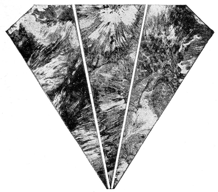
Halftone illustrates three different cards marbled and cut to form a diamond shape. Process is fully described in the following pages.

16 parts deep chrome yellow, 4 parts medium purple and 4 parts bright red.
Marbling Show Cards, Backgrounds For Photo Engravers, Lampshades, Box Tops Paper, Etc.
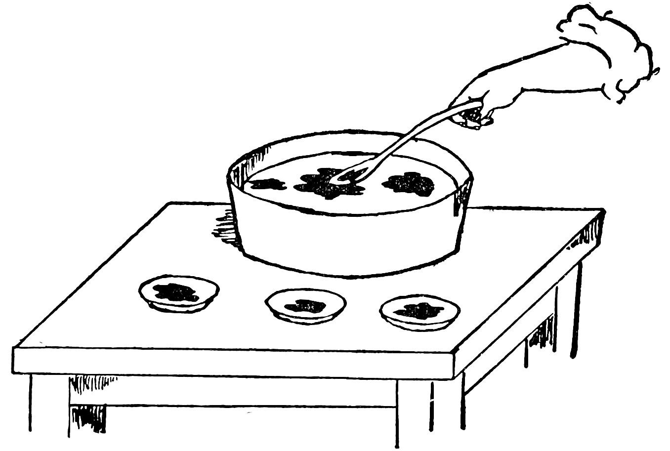
Figure 1.
Very little practice is required in this most fascinating art.
1. Thin any oil paint or printer’s ink to the consistency of water with turpentine, gasoline or kerosene, any number of colors. Mix each separately.
2. Fill a pan, wash basin, or bath tub two-thirds full with water. Size of vessel to be determined by size of card to be marbled.
3. A teaspoonful or more of each color which will readily float on the water is the next step. (See Fig. 1.) A little black used along with certain colors produce very satisfactory results.
4. With your hand or paddle agitate the mixture of water and color and before the turbulent 68waves subside, immerse card face down (See Fig. 2) being careful to wet entire surface.
To avoid air pockets (wide open colorless spaces) bend card or paper slightly as shown in figure 2. Mottled marble effects are obtained when waves are nearly settled or quite still.
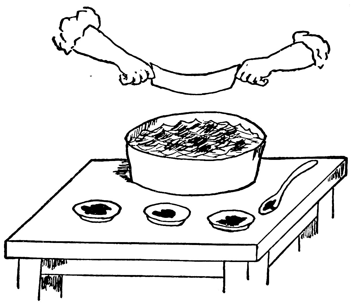
Figure 2.
The coloring adheres to the sheet instantly and it is needless to hold it under water. Colors will run if used in excessive quantity or failure to thin enough. If air pockets form, wait until thoroughly dry before redipping in solution.
White oil paint or printer’s ink may be mixed with colors to form tints before same is thinned. More thinning of colors also make lighter shades.
Over painting on these backgrounds should be 69executed with color ground in Japan to better adhere to the slightly greasy surface.
Show card writers may obtain rather unique effects with the following:
On a blank card paint or draw all or part of the lettering and border with show card writer’s white which is soluble in water.
When thoroughly dry dip into marbling solution as has been previously described, when dry, place in running water until all show card writer’s white is washed free. A clean soft brush will help loosen it.
The marbling colors should be a trifle darker with less agitation. The darker background will help show to better advantage the pure white border and lettering.
White material is best for marbling. White, a neutral color will not alter the various colors and tints applied in this process. However, colored board may be used to good advantage for certain purposes.
To Make Drawings Resemble Printing—Black and White or a Variety of Colors
First—Make light pencil sketch of subject on any good paper or cardboard such as is used when water-colors are employed. Outline all high lights and other portions which are to remain white.
Second—With brush or pen fill in all high lights and other portions which are to remain white with show card writer’s white, which is soluble in water, and let dry.
Third—Partly fill any shallow tray or dish with (water proof) ink, black or colored, if desired. Now dip drawing and let dry.
71Fourth—When black or colored water proof inks are thoroughly dry place into running water until the white is washed free from drawing, exposing the clean surface of material. Place between blotters which have been weighted and let dry.
With this process your drawings can show no brush marks. The solids will remain smooth and dense as though printed. If plates for printing purposes are to be made from drawings, you will obtain splendid clean cut results by using this dipping process.
Show card writer’s white and (water proof) black or colors may be obtained at any art shop.
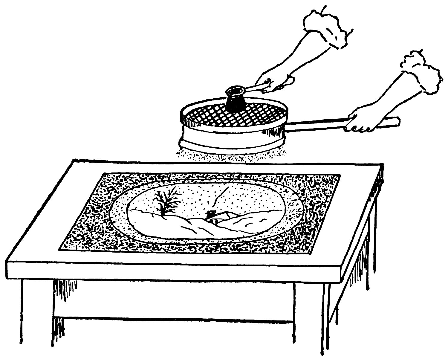
Most everyone is familiar with spatter work. Shading and background effects for drawings, show cards, art candles, etc., may be treated with spatter in one or more colors.
Color in the form of fine dots is thrown upon the unprotected portions of material by rubbing the inked bristles of a brush on a sieve or with a knife blade.
Necessary materials: India or common writing ink, a tooth brush, pocket knife, rubber cement, cardboard and some thin transparent tracing paper. The latest and most effective 73method is to spatter through a sieve, with a round medium stiff brush as shown in the accompanying illustration.
With point of knife cut out letters which are traced from painted show card and paste with rubber cement, or weight with small objects to prevent color from running under the edges, directly on the face of each corresponding letter and apply spatter. Remove these masks when the work has dried.
High lights may be added to spatter drawings with touches of Chinese or show card writers white with a pencil brush.
Gold ink spatter shows well on dark materials; white is effective on black material. Pleasing backgrounds are produced by thinly covering material with rice, flax seed, leaves, sawdust, etc. Apply spatter and let thoroughly dry before disturbing to prevent smearing.
A new practical book by a color expert, for students, artists, dyers, decorators, show card writers, painters, printers, pressmen, etc., to assist them in mixing oil colors to obtain standard and popular hues in as permanent and practical manner as possible. Great thought has been given to the permanency of the resultant colors. It takes the guess work out of color mixing.
The book gives also the results of tests for the most legible contrasts of color for show cards, posters, billboards and large outdoor advertising display signs—60 of them.
This book is 4¾ x 7 inches in size, contains 112 pages with colored frontispiece and 406 formulas for 268 colors and shades, is built to fit the pocket readily, and is bound in heavy paper covers. Sent postpaid upon receipt of Price, $1.00.
This book will be found useful to all who mix colors or paints as it is very complete. Some of the chapter headings follow: Color and Light; Description of Color Pigments; Properties of Color Pigments; How Colors Are Prepared for the Trade; Basic Paint Pigments; Painting Oils; Volatile Thinners and Driers; General Paint Mixing Methods; Color Theory, Principles and Use; Colored Paint Mixing Methods; Mixing Special Purpose Materials; Color Harmony and Management; Selecting Color Schemes; Printing Inks.
The book contains 292 pages, illustrated with line drawings and color chart. Bound in cloth, size 5 x 7½ in. Price, $2.25 postpaid.
The Color Chart
This book answers many vexing questions that come up unexpectedly every day—the little technical puzzlers that harass and hinder you most. It contains a wealth of information written in understandable form for the novice as well as the experienced user of colors.
The Color Chart alone is well worth the price of this entire book. It consists of three sections which tell how to select warm and cool colors, mix colors to get any tint or shade, harmonize colors and avoid color discord. Twenty-five individual colors appear in the chart, all applied by hand with lacquer to a cloth backed sheet that cannot be easily damaged. Mounted on it are the pivoted triangle and the arrow, both white celluloid, by the use of which color mixing, matching and harmonizing are simplified.
| Chapter I | A World of Color. |
| Chapter II | The Source of Color. |
| Chapter III | The Primary Colors and Their Uses in Design. |
| Chapter IV | The Binary Colors and How to Use Them. |
| Chapter V | Color Values: Tints and Shades. |
| Chapter VI | Complementary Colors and How to Use Them. |
| Chapter VII | Neighboring or Analogous Colors. |
| Chapter VIII | The Color Triad and the Split Complement. |
| Chapter IX | Colors in Various Degrees of Intensity—or Grayed Colors. |
| Chapter X | Psychology of Color. |
| Chapter XI | Color Harmonies in Costume. |
| Chapter XII | Color Harmonies in Interior Decorations. |
| Chapter XIII | Color in Commercial Design. |
An up-to-date book containing a complete course of instruction. Illustrated with over 100 alphabets and designs, and written in plain English that everyone can understand and thus learn to paint good signs. Also suitable for commercial artists or anyone who has occasion to do hand lettering.
Table of Contents: Introduction. Alphabets. Composition. Color Combinations. How to Mix Paints. Show Cards. Window Signs. Banners. Board and Wall Signs. Ready Made Letters. Gilding. The Silk Screen Process. Commercial Art. Tricks of the Trade.
This book contains 128 pages with 100 illustrations, including 25 full page illustrations, is bound in cloth, with jacket printed in colors. Price, $1.25 Net. Postage 10 cents additional.
Have you ever wished that you were the one who made comic drawings for the Daily and Sunday Newspapers, and received the enormous salary that some of those artists make?
Or have you wanted to draw illustrations for books, magazines, cover designs, posters, car cards, advertisements, etc.?
If you have, and still want to do so, don’t fail to get the book.
This book contains a practical course designed to lead you from the simplest elementary drawing to the higher branches of illustration and is more complete and up-to-date than many “courses” selling at many times the price of this book.
It contains 122 pages, 12 chapters with over 125 illustrations, size 5½ x 7⅛ inches, printed on coated paper and bound in cloth. Price $1.25. Postage 10 cents additional.
This eBook is for the use of anyone anywhere in the United States and most other parts of the world at no cost and with almost no restrictions whatsoever. You may copy it, give it away or re-use it under the terms of the Project Gutenberg License included with this eBook or online at www.gutenberg.org. If you are not located in the United States, you will have to check the laws of the country where you are located before using this eBook.